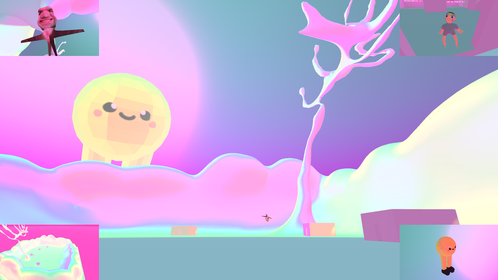
Strange Gallery Experience
Fri, 07/14/2017 - 20:24 — Protohm Johnny

Experience a strange gallery.
Inspired by some things goin' on in GT and beyond.
Made For:
An event
Experience a strange gallery.
Inspired by some things goin' on in GT and beyond.
Comments
I like the vibe that the
I like the vibe that the music, shader, and environment provide. I spend a while trying to chase down the bouncy man and everything felt right.
The works that are displayed didn't seem to have any unified vision in their curation. I found myself interested in a few of them (especially the photo of the house in the mountains and the fact that a trapper-keeper style render was attributed to "Lazy Game Reviews") but there wasn't enough of a pattern to how the pieces were organized and grouped to allow me to hypothesize how they were related in context, subject, or technique.
Hey, thanks a bunch for the
Hey, thanks a bunch for the nice words!
Gonna talk about the strange inconsistencies in the gallery art choices real quick. Instead of trying to unify it all under a given idea (like having them all be about 90s renders or all of them being photos of atmospheric places) I sort of chose things based on what I saw in recent times that reminded me of most of my childhood. This game, along with many of the shorter games I make tend to be designed as sort of a series of scrapbooks, so I can go back and remind myself of the good time I was having.
I really like how
I really like how opinionated the gallery space is here. The bright colors and music and very colorful museum goers (truly the next stage in gallery management- curating the clientele!) give a very strong atmosphere that changes how the works on display are received. I was at the moma the other day and there's an octagonal room of agnes martin works (https://www.sfmoma.org/artist/Agnes_Martin), and there's a big circular seat in the middle. The geometric layout of the room really works with the very minimal, patterned pieces and the artworks and space blend together to make something really interesting. There's a tendency to read the typical white walled, meandering rectangular spaces as a neutral backdrop to put works on, so it's always interesting to see very opinionated gallery spaces like the one you've made here.
Also, I hope you add these new boys to your asset paks :3
Thank you so much! I really
Thank you so much! I really appreciate the in-depth look at the gallery.
Checked the link to the MoMA page, and that right there is some appealing art (Untitled #9 is probably my favorite)! Really happy that something I've made could achieve an atmosphere even remotely near that.
These boyos will appear in a future asset pack, and alongside them some new shaders to display them with. I promise you that!