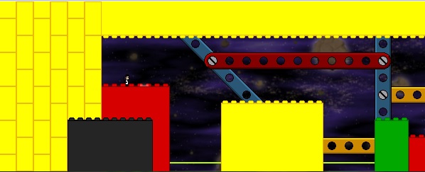
This is a challenge area heavily featuring robots. It also contains several secret areas which are more exploratory in nature (and form a good half of the unique screen total). It has two endings/exits, and I'd be happy to edit in connecting areas to other people's sections (there's one particular secret area that might be perfect for that, in fact). The level uses a gradient by Vegetal Gibber and the music is public domain, Faure's Barcarolle No.1 Op. 26 performed by the European Archive. The ambience is all Nifflas's. The two tilesets used in the level are LEGO by PONTO and MECCANO by X_SHEEP respectively.
Unique Screens: 54-60 (60 if you count sky tiles which aren't just blank, 54 if you discount tiles that you can't walk or climb on).
Powers Used: Run (you start with this one), Climb, Double Jump, High Jump, Umbrella, Eye.
Collectibles: Two artifacts (no. 5 and 6, but this can be changed).
I'm pleased with this iteration of the level (I had to completely restart at one point), and I've checked it several times for any wallswims and the like, but I'd be happy to hear anyone's suggestions and stuff like that. This is the first complete level I've ever done! I'm really happy to be working on this collaboration with you guys. Now to try and finish my other solo level project before December comes around...
UPDATE: I took the advice given to me by VG and Sergio and used darkened background tiles and a fixed gradient. The first secret area is now much easier to find your way out of and has three save points in it.


Comments
This is great! You've made
This is great! You've made so many lovely rooms! Superb choice of music. I love the eeriness of the secret area, and you're right that it would make for some excellent section connections.
When I first started playing, I often confused the Meccano tiles for solid. I still feel the background differentiation could be improved, so I tried my hand at a darker version of the tileset. Perhaps I took it too far, but I'd be interested to hear your thoughts on this matter. I also noticed that Vegetal Gibber's background graphic has a border of semi-transparent pixels, which I suspect was acquired by painting it at double resolution and then resizing. Sometimes Photoshop does this and I hate it. Anyway, I tried fixing that too.
Anyway, here's a screenshot demonstrating these changes, and the modified assets themselves are attached below.
Thank you!
I realise in my haste to fix the problems I forgot to properly thank you for correcting the textures for me! So thank you :-D I'm glad you enjoyed it and I'm glad you like the music choice too! I was so glad when I found it I was like 'goddamn this has gotta be it'
I agree with Sergio, it was
I agree with Sergio, it was very good for your first level, and I like the theme you're going for. The issue with the gradient is probably caused by the gaussian blur you applied over the original image, which sometimes leaves visible borders depending on the implementation. GIMP's blur filter doesn't seem to have this problem, or you could just use the fixed version that Sergio posted.
The hidden access to the dark maze area can be reached without the umbrella with a well-timed double jump. However, the player is unable to return to the main area after getting past the maze, since the umbrella is required for the long jump at the very end. You could either crop the ledge a bit and/or use air currents so it isn't possible to reach that spot without the umbrella, which would prevent this problem. Also, the invisible teleporter that leads to this area is hidden in a seemingly random spot with no visual clues for finding it, which I think is a bit overkill. I'd suggest adding a subtle hint, like using a different color for the prongs of the Lego block right below it.
Speaking of the secret "maze" itself, it looks cool but feels quite disorienting. I had a hard time finding my way back to the main area after collecting the artifact there (in fact, I found the exit by pure luck). Some visual hint for finding the exit would be nice. Also, I think there should be a save point somewhere, at least at the very end. I died on the laser trap just after getting past the maze and had to do the whole segment over again. Perhaps the save point itself could be the visual hint that leads the player out of the maze.
Overall, good job!
There are actually lots of ways back
The maze has three ways back to the main area, one of which is a big huge opening in the wall on the left, but the maze is clearly so disorienting it doesn't stand out as I intended. As for the secret entrance being too hard to find - I'd intended the timed laser on the screen (in the bottom left) to seem odd as it doesn't lead to anywhere big and to thus get people checking it out, but I've added a different coloured block there to make it clearer ^^ I'll also add the save point you mentioned.
I'll apply the texture fixes and upload the level with a clearer and easier-to-navigate maze in a few minutes. Anyway, I'm glad the problems weren't too bad! Thanks for letting me know about all this.
Glad the feedback was
Glad the feedback was useful. I played through the updated version. I wasn't able to reach the secret area without the umbrella this time :D Also, I like the way you hinted at the multiple paths in the dark maze.
I noticed that it's possible to access the maze and collect the red artifact by going left from x992y1121, without having to use the secret teleport at all. I suspect this is how you intended it to be, though, since the eye power-up seemed to be out of reach when accessing the dark maze this way (I was able to reach that particular screen, but I couldn't figure out how to get past the blue tiles at the top). If that's not the case, you could just put a warp object in that screen and redirect the player to a dead end when going left from there, so the only way in is via the secret teleport.
Good level, good choice of
Good level, good choice of music. The lasers/machinery reminds me of Powerhouse.
Though sometimes the background area feels a bit bland like in this room

where 3/4 of it is just that yellow rivet sliding along. Besides, that rivet would probably need more structural support (i.e. other rivets attached to it) if it's 20 tiles long.
Also I found a wallswim in x984y1122 (layers 0, 1, and 2 disabled):
