Sun, 08/27/2017 - 16:48 — Danni


Information
Room count: 56
Starting powers: Run, Climb, Double Jump, High Jump
Obtainable powers: Eye, Hologram
Collectibles (please retain these): Purple Key, Red Artifact 2, Blue Artifact 1
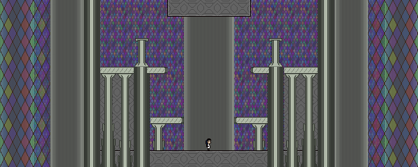
My contribution to the collab. It features a combination of exploration and challenge segments. There's also a hallway intended to connect to someone else's area. Currently it just kills you if you try to go through it.
The Compress function in the editor crashes on Wine, someone please generate a .knytt.bin for me!
Event Created For:
Made For:
An event


Comments
Will this work?
Will this work?
Really nice use of those
Really nice use of those tilesets and gradient! The area looks very nice and has a good number of screens. I enjoyed exploring it fully and finding the two artifacts, although I got stuck after that and wasn't able to find the exit. Maybe it's not placed anywhere yet?
The thin pillars having a full square collision mask felt a bit weird, but I'm guessing this was intentional so they are easier to climb, which I think is more important. I did find screen x985y964 a bit annoying, though. I had an unexpectedly hard time slipping through the numerous projectiles. Then again, I seem to be pretty bad when dealing with that particular enemy in any level :P
Since we don't seem to have
Since we don't seem to have a clear picture of how we're integrating everything yet, I figured you'd hop into the world, collect the artifacts, and then leave the world. So once you get those, you're done.
The upper area is intended to be somewhat of a difficulty spike, so I made the enemy placement there a bit tougher than the previous screens.
I'm not sure what to do about the pillar collision... there doesn't seem to be enough diversity in the invisible collision shapes that I can do "half width" for the lower tile of the column and "half width plus half height aligned bottom" for the upper tile.
Glad you liked it!