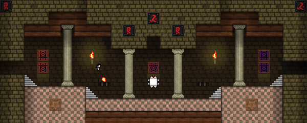
A proposal for the last area in the Cursed Gallery KS collab level. It's about 38 screens long at this time (not counting duplicate rooms).
* The current segment ends at x1036y1005.
* x1027y1006 can only be accessed with the Eye and either the Double Jump (currently not placed anywhere) or the high jump. This room could be used as a secret or easter egg. x1034y1011 (requires the Double Jump) can also be used for a similar purpose.
Feel free to contribute in any way, either by posting a comment here (I'll try to update the first post with any links/attachments) or by importing this into the full level and editing it there (screens don't need to be relocated and there aren't any new COs, so it should be fairly simple to compile). Also, any feedback will be appreciated.


Comments
Promising start! I feel like
Promising start! I feel like x1027y1007/8 and x1031y1008 could use an extra save point? I don't feel immediately compelled to continue this, so hopefully somebody else is keen to do some knytting.
Thanks for the feedback! I
Thanks for the feedback! I added an extra save point to x1027y1007 and relocated the one at x1031y1008 so the player doesn't have to cross the same two filler screens over and over every time they fail the challenges.
I've also added an extra "transition" screen that fades to an empty canvas instead of a black screen (using tileset #255 from the full level). I think this makes more sense and also makes it easier to connect this sub-area to a completely different one.
Might want to have some
Might want to have some "press down" sign or CO near the doors? Not sure why they should quantize either
Also perhaps have a brief white flash CO in x1027y1007 that comes after you take the shift in x1027y1008, so the red spike block resetting doesn't look so jarring
Thanks! I thought I had
Thanks! I thought I had checked the "Do not quantize" property on the door shift. Apparently, this wasn't the case. I've fixed that and added a simple CO below the door while I was at it.
I've also added an overly-complicated trick to make the transition between screens when pushing down the star block a bit more pleasant.
Slowly churning out another
Slowly churning out another part for this! Featuring a completely original Tileset 1 edit!

If those red pipes look familiar, chances are you already know the theme.
Woo! Looking good!
Woo! Looking good!
Neat! I especially like the
Neat! I especially like the pattern on the walls. It has a nice "bump-mapped" look to it, compared to the original. Looking forward to see the finished segment.
OK this isn't getting
OK this isn't getting anywhere so here's a download.
http://knyttlevels.com/levels/ncrecc%20-%20Temple%20of%20Gloom%20Extension%20%28INCOMPLETE%29.knytt.bin
I intended for the player to get high-jump (not double-jump) at the end of the lava sequence. It's still possible to enter the secret room in Vege's part that way, with just high jump, run, climb and eye. Anyone who wants to tamper with it, feel free.
Runs on KS+
Nevermind it's complete
Nevermind it's complete now
http://knyttlevels.com/levels/ncrecc%20-%20Temple%20of%20Gloom%20Extension.knytt.bin
Should be pretty clear where the start/end is. Replace any screens in vg's part (including the blank ones) with the screens in this part
Minor update
https://www.dropbox.com/s/iwl5pb4oh05u75l/ncrecc%20-%20Temple%20of%20Gloom%20Extension.knytt.bin?dl=0
The Tileset 1 remix is now Tileset 245 instead of Tileset 249, because that would cause some conflict with Tileset 249 in the main level
I liked the finished
I liked the finished segment! The custom graphics, attached overlay and BGM work very well together. There were some nice challenges as well.
I noticed a couple issues, though:
* Screens x1032y1011 and x902y1012 still use tileset 249 instead of 245, resulting in incorrect background tiles.
* The flag warp for x1032y1012 points to a room really far away from there (x902x1012). This isn't really a major issue, since that x902y1012 is free in the main level, but this makes it very easy to miss the room when importing the segment into another level. I'd suggest relocating that screen closer to the others (unless there's a compelling reason for doing it this way).
Fixed
Tilesets are now tuned correctly, and the alternate room has been scooted closer to the rest of the rooms. Not sure why I put it so far away, actually. Probably just impulse. Thanks for reporting, nonetheless! The dropbox link stays constantly up-to-date.
The doors leading to the red
The doors leading to the red key should probably have the shift spot CO on both sides.
Noted. Personally, I prefer
Noted. Personally, I prefer using invisible shifts on doors when the player already knows that those can be opened, but I'll add the CO there anyway for consistency.
Updated the first post with
Updated the first post with a new file that contains the two existing segments combined into a single level. I also reorganized the contents of the World.ini file a bit. Let me know if there's any issues.
Excellent work! This issue
Excellent work! This issue probably existed before, but I noticed that if you save within x1028y1007, you'll get a fade in from black whenever you respawn there.
Yeah, that was present in
Yeah, that was present in the original segment. It's a side effect from the trick I used to make the screen transition from x1027y1008 to x1028y1007 (when the star block is pushed down and the spike traps resets) a bit smoother. I tried to fix the inconsistency with a few workarounds (e.g. adding a flag warp to x1028y1007 and setting flag 0 *after* the screen transition via an invisible shift), but none of them worked as intended. If you know of any effective workaround for this, I'd appreciate the help!
Here's my attempt. It uses a
Here's my attempt. It uses a second trigger to spawn the fade-in, and a third trigger to delete the second trigger if approached from elsewhere. I also added an extra frame to FadeIn_Black.png, as I noticed it doesn't completely disappear at the end.
Thanks! This seems to do the
Thanks! This seems to do the trick in most cases. The issue persists if you die without using the save spot next to the blocks, but this can be solved either by adding more shifts and making the mechanism even more overly-complicated ("Too Many Triggers and Shifts edition", the best possible edition) or simply disabling the auto-save flag for the shift over the block (which is pretty much pointless, since there's already a save spot right next to it). I decided to go for the boring, logical approach this time. I'm rather disappointed in myself.
Thanks for fixing the animation too. I tend to make that mistake whenever I use GameMaker's editor to create simple fading animations, since it doesn't insert a blank frame at the end automatically.
I have a few unused tilesets
I have a few unused tilesets that I could either use to build another small extension to this area myself or hand over to anyone who'd like to create the next segment. Tell me which one you fancy more (and/or if you're interested in using any of them):
http://vegetal.eb-creativos.com/ksstuff/sshot/orange_grass_demo.png
http://vegetal.eb-creativos.com/ksstuff/sshot/blue_dungeon_thingy.jpg
http://vegetal.eb-creativos.com/ksstuff/wip/shaded_city_test.png
I decided to build yet
I decided to build yet another extension using the "Orange Grass Reimagined" tileset (the first one in the list above). It'll be a small outdoors area (probably about 10 screens long) with maybe a few umbrella challenges. Should be ready in a couple days or so.
We should probably reach out
We should probably reach out to all our collaborators for this area so it doesn't become an ncrecc/VG back-and-forth. Here's The Team again, with people who might not be able to contribute written in dark red:
I made a very short extra
I made a very short extra segment (from x1031y1006 to x1036y1005, 11 screens long), which will be my last contribution to this area for the time being. It's just a relatively nice looking small outdoors area with a few simple challenges and the double jump power up (though I can change this to the hologram if someone else would like to handle the double jump in their segment). This uses my Orange Grass Reimagined tileset plus a slightly customized version of gradient #247. I might also add a music track later.
I've replaced the file in the first post with an updated copy that merges all three existing parts into a single area.
Secret update
https://www.dropbox.com/s/prhtwdm2cfhh6eo/Glorious%20Trainwrecks%20-%20Gallery%20Last%20Area.knytt.bin?dl=0
Added an eye-catching indicator as to the start of the Final Area script, will be useful once merged with main area
Added two secret areas, Protofigure and Broken Hell, and two green artifacts (5 and 6)
I really want feedback on Protofigure. It has one savepoint per challenge, as with the Figure Space in Knytt Underground (which had one auto-save per challenge), but I want to make sure the challenges in general aren't too hardcore.
Loved both areas.
Loved both areas. Protofigure is pretty hardcore, but I think the difficulty is tuned well enough for the people who it will appeal to, so I don't have any suggestions. So happy I leaked that EP now! The songs could probably be lower quality to lower the filesize, though? A combined size of around 5MB is probably what I'd aim for, but if you can hear the difference don't worry about it.
This area is now part of the
This area is now part of the wider level and all work should continue there!