The Art of the Real
Wed, 02/23/2022 - 06:23 — fizzhog


Game link:
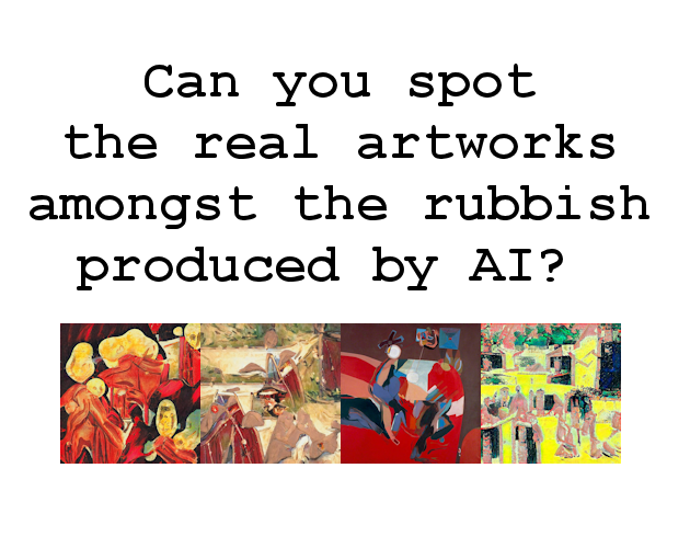
Made a little thing for a jam on itch and I thought I'd post it here as some folks might find it interesting. I wasn't planning to make anything as I'm in the middle of a bigger project but the theme was 'It is not real' and this idea came to me so I spent a couple of days putting it together. Play in browser - only lasts a few minutes.
Made For:
An event


Comments
14/15 :3 I got the Georgia
14/15 :3 I got the Georgia O'Keeffe one wrong D:
I think I only knew three of the paintings, but it seemed pretty easy to spot the things that either looked like they wouldn't be invented by AI, or the cliches that the AI generated. I do quite like a lot of the generated compositions though!
How did you get all the images?
Some people find it
Some people find it considerably harder than seems to be the case for you. That in itself has been interesting. I'd speculate that in some cases it might have something to do with how familiar people are with looking at these kinds of abstract art and also AI produced images. I suspect that someone very familiar with history of art would have very little trouble.
It's hard for me to say because I made the thing but there were a few I felt were perhaps too easy that I left in.
You asked 'How did you get all the images?' I just thought about artists some of whose work might potentially be mistaken for AI and then I googled them and tried to find just that sort of work, preferably lesser known examples. I found it interesting that some artists I thought of didn't work at all - couldn't even begin to disguise the 'hand of the artist'; Paul Klee and Willem de Kooning are examples. The AI produced stuff I made myself using Artbreeder, deliberately working quickly and not thinking too much about each image; just to be clear I didn't upload anything to Artbreeder - there is no direct connection between the real artworks and the AI stuff in that way.
13/15. This is awesome, the
13/15. This is awesome, the paintings and the alternatives are really smartly chosen and make it really difficult. It's such a savvy and fun and real way of making an art history mechanic. At first I was able to just spot artifacts of the generation process, but when there weren't obvious ones I had to look for much subtler tells. My favorite moment:
*spoiler*
On question 13 (with the Graham Sutherland), on the bottom right picture, on the left side there's a tree that folds over the railing, as if it were a shadow projected, but in the last one there are similar artifacts to the painting, but you can tell it's a tryptich, so it's human generated. I had a hunch that these AIs don't quite know about tryptichs yet :P
*spoiler*
Tips for analysis
I love this :)
Tip 1: Look for human concepts that require thinking about more than just texture and colour.
Eg: straight lines that look like a ruler was used over a long distance on the artwork. It seems many of the AI generation algorithms put too much importance on "local" (low distance) detail, ie they don't have enough concentration to draw a straight line across the whole image, especially if said line disappears and re-appears (behind other objects, or just dims).
Eg: sex and body parts. The AI isn't as driven as humans are when it comes to human sexual organs. (Albeit this brings up an interesting question of whether or not the AI is drawing attractive/reproductive/interesting AI bits for us to look at).
Tip 2: The AI algorithms seem to over-sharpen a lot of tiny details locally, whilst the genuine artwork pictures appear nice and smooth. Have a look at the example photos at https://en.wikipedia.org/wiki/Unsharp_mask if you don't know what this looks like. This is a very difficult effect to do using traditional medium (paints, inks, etc). This looks a little bit akin to over-JPEG'ing an image, ie lots of tiny bright halos and fringes on tiny details.
This last technique makes several of the puzzles easier, but not all. In some cases the AI generated images are able to keep their sharpness under control and look very authentic.
I also want to give credit to one of the AI generated images that was black and white for the whole image, but then used a small amount of colour for one spot. I was convinced this was a human design choice. I was very wrong.
very difficult! great
very difficult! great concept.